Monday, April 9, 2012

Portfolio Website Designs

In preparing to finally design a website for myself (yay!), I've been prowling the web for bits and pieces of other portfolio sites that I find enjoyable, while also making mental notes of what bugs me.

BUG
There are a few things I'm not crazy about in Zachary Bettendorf's site - namely some of the writing and the actual shots of his portfolio. I do enjoy his casual home page that cycles small, random tidbits about himself that make you want to check out the rest of the site. I also like the simple presentation and minimal color palette. I imagine that most potential clients are hoping to get a good look at a designer's work when visiting a portfolio site though, and I'm not sure this site provides that.


I also really enjoyed the simplicity of Andrew Ramos' portfolio site. Simple typography, subtle bits of texture, and minimal, but lively color made the site easy to look at and let the work take center stage. That being said, I didn't feel like Andrew presented enough work to give viewers a good sense of his talent or specialties. Conversely, I looked at many sites that bombarded the viewer with image after image of work. I've made a mental note to myself to try and find a good balance between too little and too much!


INSPIRE
One of the best presented portfolios I came across was for Baker. Granted they seem to be a larger company than most of the individual portfolios I looked at, but I thought Baker found a very nice balance of the right information and the right number of images and descriptions. The site is professional looking and easy to navigate. The list of projects (and which company they are associated with) can be viewed in its entirety, or can be sorted based on the type of work. A single, vibrant image with a brief, yet informative description appears with each image. Although I probably don't have a body of work quite this large, and I don't care for their black and purple, this is a site I can definitely see influencing my own. I also really enjoy the professional nature of their blog.


Maybe I'm crazy, but I'm also considering designing my portfolio responsively. With the continual increase in the pace of our lives and the near constant evolution of technology, it does not seem unreasonable to me that a busy client may need to view designer portfolios on the go instead of from the comfort of a desk and widescreen computer. Besides, it is a skill I would like to have, so who better to experiment on than myself.

One of the nicer responsive portfolio sites I discovered was for Oliver Russell. The neutral with brights color palette and simple typography were inviting yet professional. Rather than jumping from page to page within the site, jumplinks were used to simply hop up and down the page. The opportunity to contact the designer directly from the page is a nice addition when considering the busy users of mobile devices. In the presentation of the actual work, I think it is nice to see the "Situation" and "Solution" descriptions with each piece. These are kept brief enough to be readable, but provide a nice context for the work, and even a bit of a measuring stick to judge the design's appropriateness.


Monday, April 2, 2012

Mapping West Virginia's Poverty Data

Using IBM Research's "Many Eyes" data visualization tools, I have generated a map of all West Virginia counties using U.S. Census data about poverty. Counties are colored based on the percentage of that particular population living below the poverty level. Three different maps were generated based on educational attainment: those with no high school diploma, with a high school diploma, and with a Bachelor's (or higher) degree.  View the visualization by clicking below:

Percentage of West Virginia Population Living Below Poverty Level, 2010

It is evident from the three maps that encouraging West Virginia students to complete high school and then pursue a college education is an important step in improving the future of our state and its residents.

Friday, March 16, 2012

Websites of Interest

Week of March 12
The sites I've compiled this week have one main thing in common: responsive design.
This first site, Content Choreography, is not only a responsive design, but it's about responsive design. Although this is my first foray into reading about this topic, the site seemed to make some good points, so I thought this might be helpful for others thinking about going the responsive route.


I found it really interesting that Andersson-Wise Architects had already embraced responsive design. Currently, I think if really utilitarian sites as the ones that would be pushing for a site that functions well on any device. I can't quite imagine needing to visit this particular site from my phone, but on the other hand, it seems that being early adopters is part of Andersson-Wise's business strategy. I'm slightly bothered by the fact that the grid doesn't line up as the page scales and that the photo croppings become awkward at certain points in the scaling process. I am, however, in love with some of their houses!


For some reason, the word "Sasquatch" has come up in more conversations I've had this past week than in my entire life I think. So when I ran across this responsive site for Sasquatch Festival!, it seemed like destiny that it be included here. One thing I enjoyed about this site, is that the computer screen width features some small animation effects in the header and footer that simply become static at the tablet and phone widths.


Friday, February 24, 2012

Websites of Interest

Week of February 19, 2012
I've included the website for Analog because they have used CSS3 to achieve an embossed look to the text. It's pretty subtle, but when show side-by-side with the plain version, that little extra is nice. To achieve the look, they used a 1px text-shadow styling.


I'm including the website for Ben the Bodyguard more because I like the idea and content. "A Frenchman protecting your secrets. Yes, seriously." It's nice to see this service which is usually portrayed as technical/geeky in a fun James Bond-ish fashion. The designers and developers have really carried the theme thoroughly into every part of the app and website. As a side note, the site is using CSS3 too.


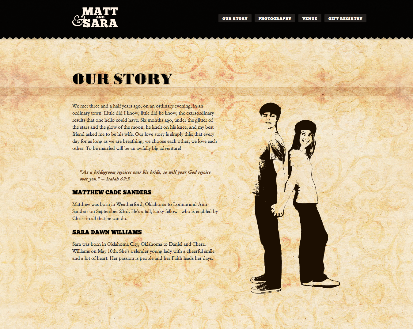
Finally, Matthew & Sara Are Getting Married is a bit more refreshing take on they typical wedding website. The simplicity of the design (and the concise text) is much more contemporary than most other "We're Getting Married" websites that I've seen that tend to suffer from kitschy overload. Like the previous two examples, this site is also using CSS3.


Friday, February 17, 2012

Websites of Interest

Week of February 12, 2012
The layout of Foxie Graphic's site first struck me as odd because of the right alignment. However, the "bookshelf" navigation was what prompted me to include this site on the blog. The down side is that this site takes longer to load that what I am normally willing to wait.


With a slightly different perspective than one might expect, Envira Media turns a design on its side (literally) to create unique areas for navigation and disparate pieces of information while keeping with a single theme.


Finally, Hem Jeans uses some small animation and layering to great effect. The belt loops and rivets do make the user work a bit harder to find the navigation, but I imagine the target audience for this brand would be willing to do the work in exchange for the unique approach. One thing I disliked about the site was that many of the pages (e.g. Lines, Fits) don't allow a user to navigate backwards. Returning to the home page is the only way to navigate elsewhere in the site.


Friday, February 10, 2012

Websites of Interest

Week of February 5, 2012

First up this week is Eclipse Creative Design Agency based in the UK. The theme of their website is based on the company's rural location and carries throughout the entire site and the blog. Small touches like the acorn images used for social media keep the site playful and light. The first page of the site features some upward vertical scrolling to climb the tree and learn more.


The Squad was another cool site. The design seemed fairly straightforward and simple, but unique.


Finally, there's the portfolio site for design Edgar Leijs. All of the mouse-over activity provide some interest and movement to what is otherwise a very minimalist site.


Friday, February 3, 2012

Websites of Interest

Week of January 30, 2012
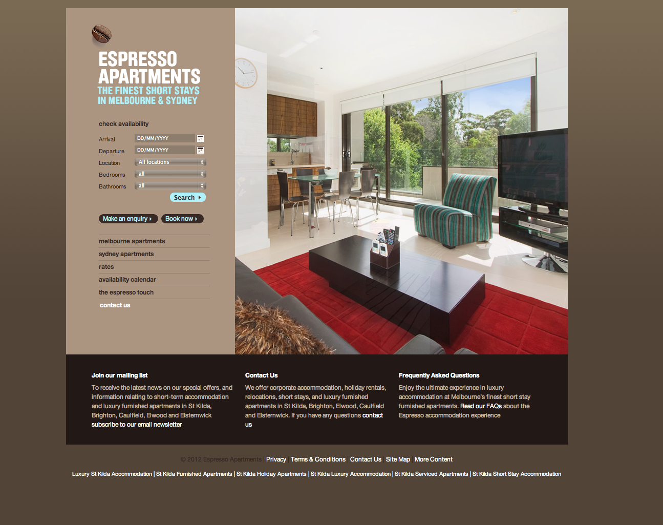
Most apartment locator and real estate sites are packed with a clutter of information with little or no hierarchy. Espresso Apartments' contemporary, soothing website uses a neutral color palette and a spacious grid to make the often stressful task of finding an apartment more pleasant.


A fun and lighthearted portfolio site that I enjoyed was stedesign. The retro imagery, the cans on the shelf and the field for sending a message provided a cohesive yet not-too-serious feel to the work.


One of the favorite concepts I came across this week was that of Forefathers. The old-timey, circus-like imagery and writing showed that real thought was put into the group's own branding efforts. The imagery alone probably would have seemed slightly generic, but the wonderful tidbits of copy that give the typography and illustrations context is very enjoyable.