Friday, March 16, 2012

Websites of Interest

Week of March 12
The sites I've compiled this week have one main thing in common: responsive design.
This first site, Content Choreography, is not only a responsive design, but it's about responsive design. Although this is my first foray into reading about this topic, the site seemed to make some good points, so I thought this might be helpful for others thinking about going the responsive route.


I found it really interesting that Andersson-Wise Architects had already embraced responsive design. Currently, I think if really utilitarian sites as the ones that would be pushing for a site that functions well on any device. I can't quite imagine needing to visit this particular site from my phone, but on the other hand, it seems that being early adopters is part of Andersson-Wise's business strategy. I'm slightly bothered by the fact that the grid doesn't line up as the page scales and that the photo croppings become awkward at certain points in the scaling process. I am, however, in love with some of their houses!


For some reason, the word "Sasquatch" has come up in more conversations I've had this past week than in my entire life I think. So when I ran across this responsive site for Sasquatch Festival!, it seemed like destiny that it be included here. One thing I enjoyed about this site, is that the computer screen width features some small animation effects in the header and footer that simply become static at the tablet and phone widths.


Friday, February 24, 2012

Websites of Interest

Week of February 19, 2012
I've included the website for Analog because they have used CSS3 to achieve an embossed look to the text. It's pretty subtle, but when show side-by-side with the plain version, that little extra is nice. To achieve the look, they used a 1px text-shadow styling.


I'm including the website for Ben the Bodyguard more because I like the idea and content. "A Frenchman protecting your secrets. Yes, seriously." It's nice to see this service which is usually portrayed as technical/geeky in a fun James Bond-ish fashion. The designers and developers have really carried the theme thoroughly into every part of the app and website. As a side note, the site is using CSS3 too.


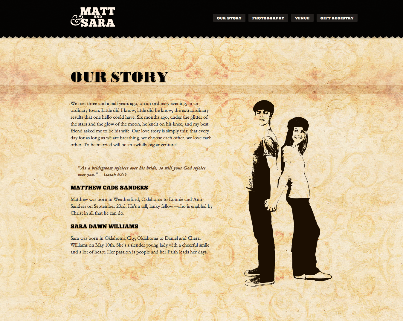
Finally, Matthew & Sara Are Getting Married is a bit more refreshing take on they typical wedding website. The simplicity of the design (and the concise text) is much more contemporary than most other "We're Getting Married" websites that I've seen that tend to suffer from kitschy overload. Like the previous two examples, this site is also using CSS3.


Friday, February 17, 2012

Websites of Interest

Week of February 12, 2012
The layout of Foxie Graphic's site first struck me as odd because of the right alignment. However, the "bookshelf" navigation was what prompted me to include this site on the blog. The down side is that this site takes longer to load that what I am normally willing to wait.


With a slightly different perspective than one might expect, Envira Media turns a design on its side (literally) to create unique areas for navigation and disparate pieces of information while keeping with a single theme.


Finally, Hem Jeans uses some small animation and layering to great effect. The belt loops and rivets do make the user work a bit harder to find the navigation, but I imagine the target audience for this brand would be willing to do the work in exchange for the unique approach. One thing I disliked about the site was that many of the pages (e.g. Lines, Fits) don't allow a user to navigate backwards. Returning to the home page is the only way to navigate elsewhere in the site.


Friday, February 10, 2012

Websites of Interest

Week of February 5, 2012

First up this week is Eclipse Creative Design Agency based in the UK. The theme of their website is based on the company's rural location and carries throughout the entire site and the blog. Small touches like the acorn images used for social media keep the site playful and light. The first page of the site features some upward vertical scrolling to climb the tree and learn more.


The Squad was another cool site. The design seemed fairly straightforward and simple, but unique.


Finally, there's the portfolio site for design Edgar Leijs. All of the mouse-over activity provide some interest and movement to what is otherwise a very minimalist site.


Friday, February 3, 2012

Websites of Interest

Week of January 30, 2012
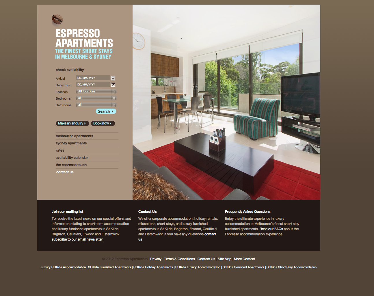
Most apartment locator and real estate sites are packed with a clutter of information with little or no hierarchy. Espresso Apartments' contemporary, soothing website uses a neutral color palette and a spacious grid to make the often stressful task of finding an apartment more pleasant.


A fun and lighthearted portfolio site that I enjoyed was stedesign. The retro imagery, the cans on the shelf and the field for sending a message provided a cohesive yet not-too-serious feel to the work.


One of the favorite concepts I came across this week was that of Forefathers. The old-timey, circus-like imagery and writing showed that real thought was put into the group's own branding efforts. The imagery alone probably would have seemed slightly generic, but the wonderful tidbits of copy that give the typography and illustrations context is very enjoyable.


Wednesday, January 18, 2012

Websites of Interest

Week of January 16, 2012
I came across this portfolio website for Kunal Chhajer this week and wanted to share it. One thing I enjoyed about his website was it's playfulness and personality within a simple, professional layout. No overwhelming amounts of color and texture or gimmicks here to distract from the information.


Another simple site, this time one that uses no imagery other than charts, is personal data tracking website Daytum. Viewing the source code revealed that <div> tags and css classes were used to create the page of individual displays.


The third interesting site design of the week comes from one of my new favorite brands, SmartWool. The site features great photography, playful color and type, and the brand's signature thread motif throughout. The screenshots below are nice, but you really need to visit this site to appreciate it. Fun and informative interactive elements are sprinkled throughout. The main navigation at the top triggers drop down boxes. Choosing an option from these will start the viewer along a scrollable "path." Although the site appears a bit shallow with only 5 navigation buttons at the top, it is incredibly thorough.


Friday, December 2, 2011

Design Education

I am one of those people who have so many hobbies that I never really excel at any of them. I am a mediocre baker. I am a mediocre seamstress. I am a mediocre runner. I only get around to reading a "few" books per year. I put so much on my plate that I get to spend about 10 minutes on each project. Although I am in agreement with Don Norman's suggestion that design education must continually evolve and attempt to fill in gaps created by new technology and a changing society, I fear that what he envisions for design education would resemble my over commitment to every hobby imaginable. It is absolutely critical that design projects consider "the interlocking complexities of human and social behavior, [...] technology, and business" as Norman advocates but it is not realistic to expect designers to conduct extensive research or spend the majority of their education in these areas. A more feasible solution, "to stress the importance of collaboration with other non-design disciplines" recommended by a commenter on the article seems more realistic and a better way to preserve the talent that makes designers special. Even a gifted heart surgeon operates as part of team of professionals with varied skills and areas of expertise: nurses, anesthesiologist, and even business professionals. None could perform the daily tasks associated with the other’s position, but together they can produce results of incredible magnitude. I’m not trying to compare designers to doctors, but teams of professionals that are considered experts can accomplish so much more than a single individual trying to act as a jack-of-all-trades.

I tend to agree more with Andy Polaine’s perspective in his response titled Design Research and Education: A Failure of Imagination? Polaine essentially advocates for our profession to be structured more like the sciences where research, theory, and practice are closely intertwined – with special attention being given to processes and their application. “We have sold what we do as magic at the cost of hiding our thinking process and when we hide our process we can no longer articulate it, teach it or give it the value it deserves.” As I thought back on many of the industry projects I’ve done, I realized the unfortunate truth of this quote. With the exception of some general brainstorming, I really could not articulate a process that I follow to produce work. How many times in school did I (and other students) blame a lack of inspiration for poor results on a project? While I’m sure scientists receive jolts of inspiration, I doubt many of them push a project to the side because they’re not feeling inspired to conduct the research or experiments that are a part of it. As Pollaine points out, and as I’ve learned from this course, understanding process is everything if we are to prove our profession’s worth to the world. AIGA is making headway in this area by encouraging designers to construct and submit case studies.

Steven Heller drills down to a more focused level in his article concerning graphic design education. Begrudgingly, I have to agree with Heller that after four years of a liberal arts education focused on graphic design, I was less than confident to enter the field. Obviously I'm a believer in education as I am back in school for my 3rd degree. The downside to adding another year to America's college education or by stripping out foundations or liberal arts is still that disconnect between theories and processes taught in design school, and corporate culture that demands styling (and now!) and cares little about how one arrives at the final product. Design educators and design practitioners of all varieties should be collaborating about how best to bridge this gap. And as Polaine points out, we need designers speaking in the media about this and requesting funding, and even starting programs in primary and secondary schools to combat these issues.