- Organization | Elements on the page will have to shift as the screen size changes, but they need to remain in a logical reading order. Some elements may even be able to go away when real estate gets tight.
- Navigation | The navigation of choice seems to be a menu button with a drop down navigation list that appears when clicked/tapped. Because my site will only have a few page categories, I may be able to get away with keeping them all on the screen as opposed to hiding them behind a button. My logic says that if I can prevent the user from having to tap or click any more than necessary - without making them scroll for day just to get beyond the navigation - then visible buttons will be the way to go.
- Typography | The type will likely need to scale down in many places as the design scales. A few sites that I looked at however, had type that scaled exactly as the page did. That means that some of the small copy became so tiny for mobile devices that it was barely readable. Scaling type to an extent, and then redesigning to accommodate larger type on smaller devices seems like a better solution.
- Spacing and Proportion | All items may not scale proportionally and still look pleasing. Some images may need to stay a bit large, others may just go away once they've scaled to a certain point. Also, spacing that works for the desktop version may feel too generous for a mobile device. Other items began to feel very cramped as they shifted from multi-column to single-column without any change in organization or spacing.
Sunday, August 25, 2013
Responsively Designed Sites
In preparation of designing my own responsive portfolio site, I found that the best way to understand the considerations of a scalable site was to look at as many as possible and write a list of things that bothered me, or things that were especially delightful. The main issues I encountered revolved around:
Monday, November 12, 2012
Design Patents
I had very little knowledge of design patents before reading Michael Hages' The Design of Design Patents originally published at Core77.com. I found the collection of articles incredibly informative, and surprisingly easy to understand and follow. Although I started to get a bit lost when he discussed the narrow to broad patent application strategy, I could certainly understand his theories for why design patents are taken for-granted, and how they can be restored to a useful place. I thought Hages' four questions to help designers communicate better with lawyers were a great distillation of the discussion, and were actually useful for a designer to sit and think about for any particular design - whether applying for a patent or not. Had I decided to apply for a patent, I most likely would have started just as the author hypothesized, by trying to read through nearly incomprehensible patent rules. This was a fantastic article that any would-be inventor or entrepreneur should read.
As far as my Gluten-Free Goodness project is concerned, I've spent the week preparing for Friday's test run. I have laid out a protocol for the restaurant staff, made some revisions to the table tents and order cards, pre-written social media blasts to run on Wednesday - Friday, and designed a brief survey which is all ready to go in Survey Monkey and will be used to supplement in-person feedback I receive on the day of testing. Let's hope those gluten-free Morgantonians come out in hoards!
Wednesday, November 7, 2012
Design | The New Business
As someone with a business background and a desire to pursue entrepreneurship, this week's video and readings were particularly hopeful. Because of Startups, This is How Design Works, I've decided to post Dieter Ram's 10 Principles of Good Design near my computer as a sort of checklist for each project I begin! Dieter Ram says good design is...
Although I found Design | The New Business to be a bit slow in parts, I collected a few pages full of interesting quotes from the designers and business professional that were interviewed. One of the first interviewees stated that "managing complexity is one of the huge opportunities of our time." I agree fully and hope that I am trying to do that in all areas of my life, particularly "design." I also liked one definition of a good designer.
I like this duality.
I've also long wondered why our design department isn't in continuous collaboration with the School of Business. One interviewee quoted that "design without business is a pointless exercise." Perhaps because I have an art background it's tough for me to accept that word "pointless," but I think it should at least urge designers to think outside the art and typography bubble and look at their work from a businessperson's perspective.
While I enjoyed reading Fast Company's "The United States of Design," I'm not really sure if I agree with the author, or if I completely disagree with the author. She admits to making generalizations - and she does, in a big way - about national aesthetics and commitment to design, but she never truly comes full circle. While she does proffer that perhaps American design is so diverse and innovative because many greats have migrated to the US from other countries, the entire article still seems very biased and narrow. Perhaps we tend to think of American design in this way simply because we hear more about it in the media? Tischler writes
I also don't completely understand the desire of some folks within the design industry to be recognized or have an official branch within the government. In some respects, a government organization seems at odds with innovative design! The small forest worth of paperwork that my bank and lawyer have to complete in order for me to buy a house hardly seems congruent with innovation, pragmatism, or streamlined-ness (not a real word, just trying to make a point). Innovation seems to happen more frequently in garages or scrappy start-ups, so I have to wonder what a behemoth bureaucracy like the US government could contribute to foster more innovation?
GLUTEN-FREE GOODNESS PROJECT UPDATE
Good news this week, Terra Cafe has agreed to test some of my ideas and prototypes! It's going to be another week before that testing happens, but plans are in order to use my "front-of-house" components like table tents and customer-written order cards to find out whether gluten-free customers feel more welcome and at ease, and if kitchen staff feel they achieve greater protection against cross-contamination by using these simple, color-coded prototypes. I better whip out my exacto knife and double sided tape because I have 20 tables to accomodate for next Friday's lunchtime crowd!
innovative
makes a product useful
aesthetic
makes a product understandable
unobtrusive
honest
long-lasting
thorough
environmentally friendly
as little design as possible.
Although I found Design | The New Business to be a bit slow in parts, I collected a few pages full of interesting quotes from the designers and business professional that were interviewed. One of the first interviewees stated that "managing complexity is one of the huge opportunities of our time." I agree fully and hope that I am trying to do that in all areas of my life, particularly "design." I also liked one definition of a good designer.
A good designer has the ability to translate a need or desire of the customer into a business proposition OR translate a business capability into a product for the user.
I like this duality.
I've also long wondered why our design department isn't in continuous collaboration with the School of Business. One interviewee quoted that "design without business is a pointless exercise." Perhaps because I have an art background it's tough for me to accept that word "pointless," but I think it should at least urge designers to think outside the art and typography bubble and look at their work from a businessperson's perspective.
While I enjoyed reading Fast Company's "The United States of Design," I'm not really sure if I agree with the author, or if I completely disagree with the author. She admits to making generalizations - and she does, in a big way - about national aesthetics and commitment to design, but she never truly comes full circle. While she does proffer that perhaps American design is so diverse and innovative because many greats have migrated to the US from other countries, the entire article still seems very biased and narrow. Perhaps we tend to think of American design in this way simply because we hear more about it in the media? Tischler writes
"The U.S. design community has a distinctive mind-set and perspective. Its design is pragmatic, with an emphasis on marketplace appeal; streamlined, in a way that focuses on ease of use; and democratic, which fuels the integration of new ideas, new processes, and new business models."I have a very hard time believing that American design - like one-click ordering from Amazon - is any more pragmatic or streamlined than (what may appear to us) to be a rudimentary tool or system used by farmers in a remote village somewhere in the world who's family's entire livelihood depends on his/her productivity and ingenuity. She also tries to contrast American products like hard-working John Deere machinery and post-it notes to decorative "elegant china or precious chairs" from other countries. Hardly a fair or useful comparison if you ask me.
I also don't completely understand the desire of some folks within the design industry to be recognized or have an official branch within the government. In some respects, a government organization seems at odds with innovative design! The small forest worth of paperwork that my bank and lawyer have to complete in order for me to buy a house hardly seems congruent with innovation, pragmatism, or streamlined-ness (not a real word, just trying to make a point). Innovation seems to happen more frequently in garages or scrappy start-ups, so I have to wonder what a behemoth bureaucracy like the US government could contribute to foster more innovation?
GLUTEN-FREE GOODNESS PROJECT UPDATE
Good news this week, Terra Cafe has agreed to test some of my ideas and prototypes! It's going to be another week before that testing happens, but plans are in order to use my "front-of-house" components like table tents and customer-written order cards to find out whether gluten-free customers feel more welcome and at ease, and if kitchen staff feel they achieve greater protection against cross-contamination by using these simple, color-coded prototypes. I better whip out my exacto knife and double sided tape because I have 20 tables to accomodate for next Friday's lunchtime crowd!
Monday, October 29, 2012
FastCo.'s 2012 Innovation By Design Awards
As I read through the 2012 finalists in Fast Company's Innovation By Design Awards, I really enjoyed the fact that the recognized innovations ranged from an easy to open keyring (my fingernails thank you!) to aircraft. What a range! Here were two of my favorites among all the finalists.
BioLite CampStove
First off, this seems like an overdue innovation for campers and backpackers. It's not the smallest stove out there (BioLite is roughly the size of a Nalgene bottle), but it does eliminate the need to carry any type of fuel. That's a plus as far as weight is concerned, but it's also nice to know that you're not going to have any fuel accidentally spill inside your pack and ruin the trip. Although I'm completely against taking an iPhone on a camping trip (old-fashioned, I know), having a USB port for some type of emergency situation is huge. I wonder now how many USB accessories will start to pop up to take advantage of this. The stove would also be great to have on hand for general disaster preparedness. Even before reading a blurb on BioLite's website about this, I was thinking about all the East Coasters who are in panic mode as we brace ourselves for Hurricane Sandy. Facebook is alight with concerns over no secondary heat source beyond electric and no generator (or gas to power a generator). Requiring a very small amount of storage space, this could be an option for families to, at the very least, be able to boil water in the event of an emergency. (Finding dry wood to burn in the wake of Sandy may be a futile effort though!)
All of that is great for a camper. What really intrigues me about BioLite though, is that they are looking at the triple bottom line. Rather than simply using profits to support charities around the world, BioLite is using their innovation to improve the lives of impoverished around the world by creating a HomeStove version that is slightly larger and more permanent than the CampStove. Approaching sustainability from both an environmental and a business standpoint, they don't view this second product as a handout, but as a low-cost product for purchase. BioLite's website explains
The other innovation that I really enjoyed reading about was Pain Squad, an iPhone app that "gamifies" the pain diary that adolescent cancer patients keep to help doctors understand and treat the pain associated with their cancer. Since I don't have any children, I've never stopped to consider how difficult it must be to get children to articulate their pain: where it hurts, how much it hurts, how long it has felt that way, how it affected their daily activities. It's probably difficult to get that out of adults, much less children! The idea of creating a game, complete with rewards and appearances by favorite characters and TV personalities seems like a truly innovative way to improve the quality of life for kids who are dealing with such a difficult road. I can't imagine any actor that wouldn't volunteer immediately to lend their talent or character to this effort. And with the hope that this will increase the amount of meaningful data for healthcare professionals, I can see this innovation eventually leading to improved care and medical breakthroughs.
Throughout my project, I've struggled to understand just what service design is and how I am supposed to improve upon a pattern that has existed for many, many years. This innovation helps me see that the idea can be a very simple one (help kids track their pain) but the solution can lead to much, much larger improvements.
BioLite CampStove
First off, this seems like an overdue innovation for campers and backpackers. It's not the smallest stove out there (BioLite is roughly the size of a Nalgene bottle), but it does eliminate the need to carry any type of fuel. That's a plus as far as weight is concerned, but it's also nice to know that you're not going to have any fuel accidentally spill inside your pack and ruin the trip. Although I'm completely against taking an iPhone on a camping trip (old-fashioned, I know), having a USB port for some type of emergency situation is huge. I wonder now how many USB accessories will start to pop up to take advantage of this. The stove would also be great to have on hand for general disaster preparedness. Even before reading a blurb on BioLite's website about this, I was thinking about all the East Coasters who are in panic mode as we brace ourselves for Hurricane Sandy. Facebook is alight with concerns over no secondary heat source beyond electric and no generator (or gas to power a generator). Requiring a very small amount of storage space, this could be an option for families to, at the very least, be able to boil water in the event of an emergency. (Finding dry wood to burn in the wake of Sandy may be a futile effort though!)
All of that is great for a camper. What really intrigues me about BioLite though, is that they are looking at the triple bottom line. Rather than simply using profits to support charities around the world, BioLite is using their innovation to improve the lives of impoverished around the world by creating a HomeStove version that is slightly larger and more permanent than the CampStove. Approaching sustainability from both an environmental and a business standpoint, they don't view this second product as a handout, but as a low-cost product for purchase. BioLite's website explains
"We believe in market-based approaches to poverty alleviation. By creating solutions that are effective, affordable and desirable to the end user, we can reach more people more effectively. Sales of the CampStove help to support the one-time market establishment costs for the HomeStove. This is not charity, or a one-for-one model, but simply the capital needed to incubate self-sustained energy access for the people who need it most."Pain Squad
The other innovation that I really enjoyed reading about was Pain Squad, an iPhone app that "gamifies" the pain diary that adolescent cancer patients keep to help doctors understand and treat the pain associated with their cancer. Since I don't have any children, I've never stopped to consider how difficult it must be to get children to articulate their pain: where it hurts, how much it hurts, how long it has felt that way, how it affected their daily activities. It's probably difficult to get that out of adults, much less children! The idea of creating a game, complete with rewards and appearances by favorite characters and TV personalities seems like a truly innovative way to improve the quality of life for kids who are dealing with such a difficult road. I can't imagine any actor that wouldn't volunteer immediately to lend their talent or character to this effort. And with the hope that this will increase the amount of meaningful data for healthcare professionals, I can see this innovation eventually leading to improved care and medical breakthroughs.
Throughout my project, I've struggled to understand just what service design is and how I am supposed to improve upon a pattern that has existed for many, many years. This innovation helps me see that the idea can be a very simple one (help kids track their pain) but the solution can lead to much, much larger improvements.
Sunday, October 21, 2012
Build to Learn - Part I
There’s no question that IDEO knows a thing or two about
prototyping
As I began deciding exactly what to prototype, I continually asked myself “What if…” and “What
else?” By referring back to my experience map from a few weeks ago, I developed
a list of every potential “thing” that might be involved in the ordering and
preparation of a gluten-free meal in a restaurant – items both “behind the
scenes” and “on the stage.” While this is an attempt to innovate a service, these physical items play a
major role in the process, and also provide the playground for the innovation.
In using color as a safety mechanism, these are all the things that could be
colored and branded GLUTEN-FREE in order to translate into a safer and more
enjoyable experience for the customer.
BEHIND THE SCENES
Labels and dedicated storage for incoming gluten-free
ingredients. Making sure that all staff are on the same page about the safety
of ingredients, and to minimize the potential for cross-contamination, all
incoming raw materials should immediately be branded with the gluten-free mark
and stored in a color-coded, dedicated storage area.
Prep and service materials. Although many utensils
and cookware/dinnerware can be safely used for both regular and gluten-free
meal preparation, some items should be dedicated to gluten-free only meals. At
a minimum, the following items should be colored and branded to signal
gluten-free specific:
Counter and prep area
Grill or griddle
Fryer (and frying oil)
Strainer and colander
Cutting board
Pizza and bread pans
Spoons, spatulas/turners, whisk,
knives, and tongs
Apron
Ovenmitt
Dish cloth and dish towel
Gloves
Dinnerware (This is more for the
purpose of reminding staff and ensuring the customer that their meal was
carefully considered. Technically, dinnerware can be safely shared between
gluten-free and regular meals.)
Posted preparation instructions. It is crucial that
the restaurant post and adhere to a specific protocol for ensuring the safety
of gluten-free meals.
ON THE STAGE
Welcome “gluten sensitive” notification. Letting
customers know right away that a restaurant is aware of and understands gluten-sensitivity
needs encourages greater dialogue and can be a pleasant surprise for new
customers.
Gluten-free menu. This should be a separate menu
that is NOT based off the regular menu. Sections like “About our ingredients”
and “About our preparation” can help ward off numerous questions for the
server/chef and allow the customer to easily decide if the restaurant meets
his/her own personal safety needs.
Gluten-free table marker. This item would
immediately designate the table or diner as gluten-sensitive and serve as a
continual reminder to all restaurant staff of the enhanced safety needs.
Gluten-free order card. To help eliminate potential
miscommunications between customer to server and server to chef, gluten-free
diners would complete their meal selection on a card that is transferred to
every staff member that handles the gluten-free meal. The card would also
prevent one server from picking up or modifying another server’s order in a way
that may be detrimental to the diner (despite their best intentions to help).
The card serves as a constant reminder to all staff and as a signal of
compliance and safety to the customer when it is returned to them alongside the
meal.
Take-home/online evaluation. This would give the
customer ample time to determine if the food was safe or caused sickness.
In addition to this list, the online, mobile,
and social
media outlets should reflect and reinforce the company’s commitment to
gluten-free customers and adhere to the same branding and color-coding.
Sunday, October 14, 2012
3 Concepts Research
I did not get my blog post finished on schedule this week.
Now I believe there’s a reason for that. Okay, so maybe it’s not a real excuse,
but I plan to use it anyway. I had the opportunity to travel to San Francisco
for AIGA’s Gain conference this week and was really struck by something that
was brought to light in Norman’s Design of Everyday Things “Design For Change”
chapter: faucet design (and public restroom design in general) is incredibly
frustrating when you pause to pay attention! The bathroom sink in my
beautifully renovated hotel room consisted of mirrored knobs that Norman
lambasted in his book. Even more frustrating was that the flow of water out of
that faucet was almost exactly the same volume regardless of how many knobs or
how far the knobs were turned, making the proper direction in which to turn
knobs off harder to determine. By day three, I was (sort of) getting the hang
of things. Another problem on top of that, was that the tall faucet poured a
long ways down to a shallow sink, meaning that water splashed everywhere when
it hit the sink bottom, or my hands, or my toothbrush. And because I’m on a
roll… another issue in the bathroom was a light switch. The toilet and shower
were in a smaller room with their own door so that one person can be using
those while another can use the sink. Pretty thoughtful. But the light for the
toilet/shower room was outside of that door. EVERY. SINGLE. TIME I went into
that room, I had to walk back out to turn on the light because I had forgotten
to switch it in advance. I can envision this becoming an even bigger issue in a
family with mischievous kids. I can guarantee you that I would have purposely
turned the light off while one of my family members was inside, knowing they
could do nothing about it when I was younger.
I encountered other restroom problems over the course of the
trip. In the conference building, the individual stalls in the women’s restroom
were apparently designed to look very sleek and neat, with minimal visual
disruption. Unfortunately, this made it impossible to tell if a stall was
occupied without bending over to check for feet. There was also no indication
of which way a stall door opened. When it came time to wash hands, there were
four sinks in a line. The problem is that there were only two soap dispensers
and they were located on the ends of the line so that the ladies using the two
center sinks had to stand and wait until the person beside them finished and
moved away before they could access the soap. This proved very slow and
frustrating when a large group is taking a quick restroom break in between
sessions. I also used a variety of automatic sinks, once of which would only
dispense about two seconds of water before you had to remove your hands and put
them back in front of the dispenser to get a second, or third, or fourth, or
fifth squirt of water. One paper towel holder would only dispense the paper
towel after the patron held a hand still in front of the sensor for a few
seconds. Many women waved and waved their hand before giving up and drying
their hands on their pants. All it took to really understand the principles
that Don Norman advocates for, was a few days outside of my normal surroundings
and routines. Thank you Don, for making me even more critical of public
restrooms. J
One more thing that really stood out to me from the
readings, was a statement Norman made about designers also being users. I chose
to tackle an issue that is one I have dealt with often and one that I hope to
be able to make use of. As I conduct research and prototype the solution, I
will have to remember that – even though I am a user – input from other users
who are not so familiar with the project will be very important to keep pushing
me toward the best possible solution. Norman warns, “Even when designers become
users, their deep understanding and close contact with the device they are
designing means that they operate it almost entirely from knowledge in the
head. The user, especially the first-time or infrequent user, must rely almost
entirely on knowledge in the world.”
PROJECT RESEARCH
I spent the week collecting ideas that were similar to or
applicable to the three concepts I was considering for improving the dining out
experience for those following a gluten-free diet.
Concept #1 – Color-coding to improve safety
There are many examples of industries and businesses
employing color to help improve the safety of workers and/or customers. In
1970, the Occupational Health and Safety Act (OSHA) was passed and involved the
use of color-coding to help workers identify and safely react to hazards. Their
universal code is:
Red – fire-extinguishing and
protective equipment, flammable liquids, emergency stop buttons & switches,
etc
Yellow –
caution, indicates physical hazards (tripping, falling)
Orange –
dangerous parts of equipment where body parts may be caught
Blue –
equipment under repair
Green –
first aid and safety gear or equipment
Purple –
radioactive materials or equipment
Similarly, Sherwin Williams Safety Color Guide provides a code
for painting certain physical hazards and pipe identification to improve
safety.
Medical facilities have made efforts to use color-coded
wristbands to rapidly communicate key information about a patient. If a patient
is moved from unit to unit or if new staff interact with the patient, they can
immediately know important details about the patient based on the color of the
wristband.
Unfortunately, this system is not universal between
hospitals, and some confusion occurred with patients that wore yellow
Livestrong wristbands when they came to the hospital. More recently, there have
been efforts to standardize this system among all medical facilities, and to
remove any colored wristbands a patient is wearing once admitted in order to eliminate
potentially fatal mistakes.
Within the food industry, there are some color-coded
products (like cutting boards, below) already that are focused on preventing cross contamination between
things like raw poultry, raw and cooked meats, vegetables, dairy, nuts, etc. I
know many gluten-free diners use some color-coding or labeling in their own
homes to prevent cross contamination if all family members do not follow a
gluten free diet. Some restaurants and food producers, like GF favorite Rudi's already use color-coding or zones to promote food safety and to prevent cross-contamination between foods like raw meat and vegetables.
I think this idea has potential to be very helpful to
restaurant staff, which translates to a safer experience for the diner. I also
think this idea has potential for scale.
Concept #2 – Embrace & celebrate the problem or
difference.
Dealing with a disease or special medical needs can be
stressful, intimidating, and just “un-fun.” It can also be embarrassing to talk
about. I don’t exactly enjoy explaining the particulars of my gastrointestinal
issues to friends or strangers. However, trying to live in denial or be
secretive about serious problems can lead to stress and additional sickness
that inhibits recovery or good quality of life. I believe this is why numerous
campaigns have embraced humor and honesty in their campaigns. Most of us have
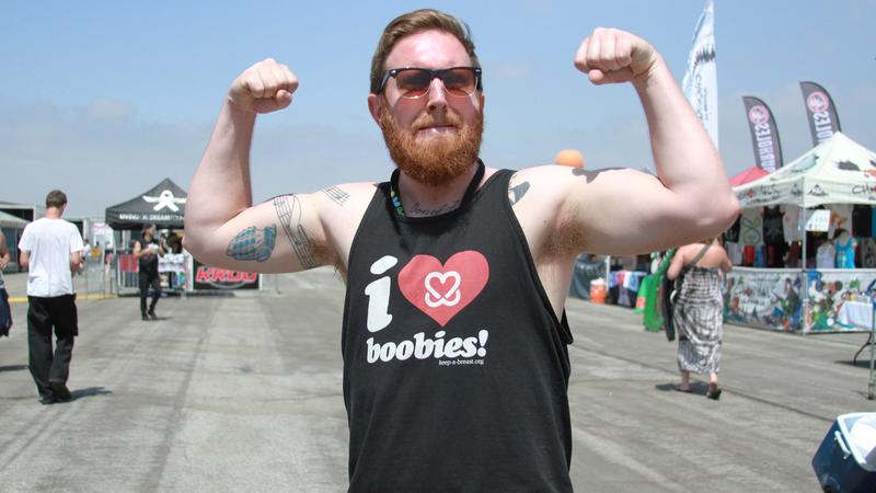
seen at least one of the irreverent breast cancer campaigns that aim to remove
the stigma associated with the disease.
While gluten intolerance is a very different kind of
disease, I think this concept could help promote conversation and understanding
among a greater number of people. The folks behind the “Feel Your Boobies”
campaign believe that their use of unexpected and unconventional methods help
younger women in particular pay greater attention to their health when
encountering these messages whereas they tune out traditional or clinical
messages. I think this could also be a
good option, with potential for scale. It would be important to keep this tied
to dining out however, instead of creating just another campaign to raise
awareness of the disease.
Concept #3 – Gluten-free family night
It was tough to find quantifiable information about the success of restaurant family nights. While it seems that chain restaurants such as Pizza Hut and Chik-fil-A have built quite a following using family night, this initial concept does not seem conducive to scale or reproducability outside of an individual restaurant. While I have no doubt that a single restaurant could make great headway hosting a gluten-free family night, the success of that would depend greatly on the menu and price offerings, as well as the atmosphere of the restaurant and commitment of the staff. I'm not saying that there isn't room for innovation in this area, but I did not find information or numbers that made this concept feel right for my particular project.
After all this research and some deliberation, I would like to focus on the color-coding for safety concept, with maybe a bit of concept #2 (celebrate the difference) thrown in the mix. By combining bits and pieces of these ideas, I think it is possible to create a better experience for gluten-free diners that any restaurant could reproduce.
Tuesday, October 2, 2012
Coloring Outside the Lines
Tom Kelley's Coloring Outside the Lines chapter of the Art of Innovation struck a bit of a nerve this past week. I've been working with a client who doesn't sit still long enough to formulate a "plan of attack," but rather tries this and tries that and takes up a significant portion of my time by doing so. This lack of organization and inefficient way of working has a tendency to cause me great frustration. I prefer to break things down into stages and figure one stage out before moving onto the following. I'm learning more and more though, that's not how most small businesses operate. Then I opened up The Art of Innovation and read "Those who try to scientifically measure opportunities sometimes miss the boat." Then I read "The person who toils endlessly at his desk is not likely the person who is going to hatch a great innovation." And THEN... I came across this video with John Cleese discussing creativity and being in "open mode" as opposed to "closed mode." Basically, I've come to the conclusion that I need to stop trying to work in such a linear fashion and not worry about having all the answers before getting to work on the problem. Relax. Be a little imperfect. See where it leads you. :)
Chapter 13 gave a great warning about feature creep and featuritis when designing products and services. "Where there's featuritis - or fat - opportunity is nearby." We all want to design a product or service that everybody will love, but Tom Kelley warns that "Refining products is not a popularity contest. You have to take risks and you will alienate some people." I thought about that and realized that even the ubiquitous iPhone doesn't enamor everybody. While making sure there is a market for your new product is important, it isn't necessary to please everybody and to add and add and add in an attempt to gain more popularity among users. What really struck me as I researched The Designer Fund and many designer founders, is that most of them created a product that was solving a relatively simple problem, and a product that had one core use. Of course that doesn't mean that the development of the product or the launch of the company was simple by any means, but to all of us ordinary users, it's easy to look at an app or service and say - that's so simple, why didn't I think of that?!
For my own research, I've spent the week brainstorming on what type of cooperation I may require from a restaurant. What things do I need to know from them? What changes might I want them to try? What can we do together to make their restaurant THE destination restaurant for gluten intolerant diners in Morgantown?
Chapter 13 gave a great warning about feature creep and featuritis when designing products and services. "Where there's featuritis - or fat - opportunity is nearby." We all want to design a product or service that everybody will love, but Tom Kelley warns that "Refining products is not a popularity contest. You have to take risks and you will alienate some people." I thought about that and realized that even the ubiquitous iPhone doesn't enamor everybody. While making sure there is a market for your new product is important, it isn't necessary to please everybody and to add and add and add in an attempt to gain more popularity among users. What really struck me as I researched The Designer Fund and many designer founders, is that most of them created a product that was solving a relatively simple problem, and a product that had one core use. Of course that doesn't mean that the development of the product or the launch of the company was simple by any means, but to all of us ordinary users, it's easy to look at an app or service and say - that's so simple, why didn't I think of that?!
For my own research, I've spent the week brainstorming on what type of cooperation I may require from a restaurant. What things do I need to know from them? What changes might I want them to try? What can we do together to make their restaurant THE destination restaurant for gluten intolerant diners in Morgantown?
Subscribe to:
Posts (Atom)